

Instacart
A UX Case Study

Identify UX problems and finding solutions for
Instacart Mobile App
OVERVIEW
This project was a UX case study.
I wanted to study the Instacart mobile app as a user and identify some UX problems and find solutions for them.
I have never used Instacart app or website before. So started with downloading the ios app on the mobile phone.
MY ROLE
UX Designer
TOOLS USED
Sketch
GOAL
Understand Instacart app as a user, identify 5 UX problems, and find the solution. Do one problem in detail.
I started with understanding the Instacart ios app. I used it as a new user. When I was using the app, I identified some UX problems.
Checkout Process is long and not intutive
Reason:
A long checkout process and not working links and icons will give users a bad experience.
Solution:
Optimize the checkout process and make it more intuitive by working links, add more item buttons, buy it again suggestions.
Use the card component to minimize the scroll down and to fit more important information on the visible screen.
Problems with cart Screen
2. The store list is displayed randomly on Home Screen
Reason:
Because of a random store display, it’s hard for users to search for the store.
Solution:
Use filters for stores based on distance, rating, category, location, demographics
Problems with Home Screen
3. Sale items section lacks personalization
Reason:
Sale item shows random items or popular items. Some items are also repeated because there are no personalized recommendations.
Solution:
Giving users personalized recommendations in the initial view will help. It should be based on the user’s purchase history. So user should not have to go down the page and finding not-relevant items.
Any category should not be repetitive.
Problems with Sale Screen
4. Search is not intutive, not give relevant results
Reason:
Because the search menu item and search engine are not optimized. For eg. No option for vegan items or when searched for the lactose-free items it doesn’t give appropriate results.
Solution:
Adding more options to the search menu items like vegan, on-sale items, etc.
Search engine optimization will also help.

Problems with Search Results
5. Navigation is not easy
Reason:
For many screens, the user has to go back to reach the homepage or the store’s landing page because the store’s icons are not working as a connecting link and not a consistent menu button.
Solution:
Make the Instacart home screen and stores where the user is shopping accessible all the time. This will improve the user experience.
Problems with Navigation
PROBLEM IN DETAIL
Among all the problems, the checkout process problem was a big problem. So I wanted to understand the problem in detail and find the solution.
The overall user experience of the checkout process is not optimal and intuitive
Add items:
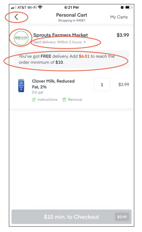
When the user has to add more items to get minimum dollars total for the free shipping, they have to go back to the previous screen. If the user has two separate stores in their cart, they have to go back to the home screen and find that store, select it then add items. This is a painfully long process because there is no direct access to the home screen.
Sometimes, even though there is no minimum amount of items to buy, users realize they need to buy something and forgot to add it. In this scenario also have to go back to the previous screens.
This could be because of development work needed to create the flow and they should add these features as enhancements in future phases.
Next delivery window:
There is the next delivery time action which is intuitive. But when the user clicks it, it takes them to the information screen about the available time slots. But users can’t select any time window. They have to go back to the cart screen.
This could be because of the way they have developed the flow however it is not intuitive.
There is no way to check out a separate store cart
Users have to check out all the store’s carts or remove other carts.
This could be a business decision. Instacart wants users to check out everything they have in their cart from different stores or the same store.
Item suggestions
Item suggestions on this screen are relevant to the current cart which is not useful most of the time, and items are still irrelevant.
This might be because of the lack of personalization algorithms development.
I created use cases to solve the problem. I created mainly three types of use cases and broke them down into small use cases.
Then I started sketching different ideas about the cart screen.
Paper sketches for the Cart Screen
Wireframe
After that, I took my ideas to the SKETCH and started developing the wireframes.
Cart Screen Wireframe
USER FLOW
I created the checkout flow focusing on the user experience of the cart screen.
LEARNINGS
UX case study for one of the popular app as a new user
How to solve a complex user flow problem
How to explore the app and understand it empathetically for the users